



Branding 2026
REMŠÍK a partneri — branding and design manual
A premium visual identity for a law firm from Banská Bystrica
View live website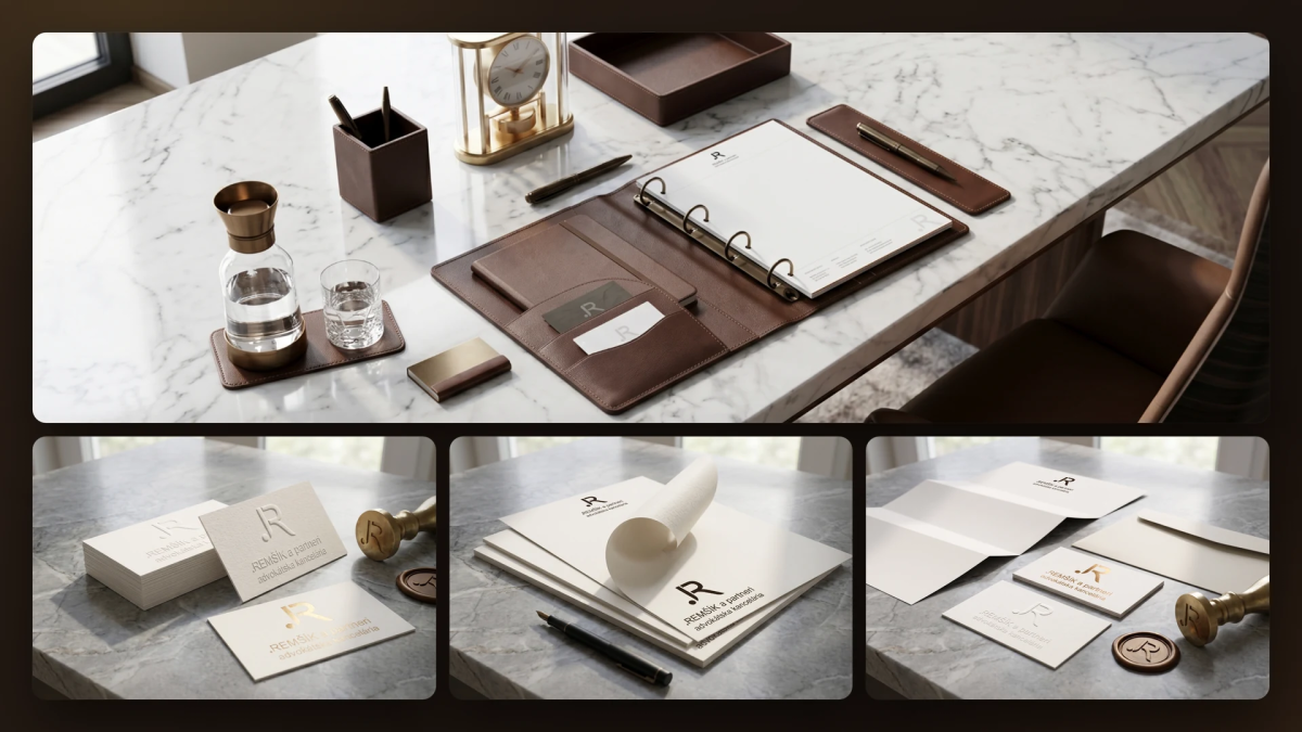
01
The brief
REMŠÍK a partneri provides legal services across a wide range of areas, from civil and commercial law to complex criminal cases. The firm needed an identity that conveys authority, discretion and long-standing experience while still feeling contemporary.
Legal practice is built on personal contact and written correspondence. The brand therefore had to be at its strongest in physical form: on paper, leather, brass and in the firm's offices. The manual was to set clear, binding rules for everyone who works with the identity.
Legal practice is built on personal contact and written correspondence. The brand therefore had to be at its strongest in physical form: on paper, leather, brass and in the firm's offices. The manual was to set clear, binding rules for everyone who works with the identity.
02
How we solved it
Monogram and logo
The foundation of the identity is a geometric R monogram with a dot in which the initials merge into a single mark. It is complemented by the partnership's name, firmly anchored typographically, and the descriptor “advokátska kancelária” (law firm). The primary logo has a vertical composition. Smaller formats use a shortened set without the descriptor, the monogram alone (favicon, watermark, emboss) and a circular seal badge “EST · MMXXVI” for stamps, certificates and wax seals.
Construction and clear space
The monogram is built on a modular unit x equal to the weight of its vertical stroke. The symbol is 8x tall, the logotype's capitals are 4x and the gap between monogram and logotype is 2x. A 2x clear space applies around the logo. The minimum size is 28 mm in print, 180 px on the web and 16 px for the favicon.
The dot as the brand's signature
Parts of the logo — the dot, the monogram, the bronze rule and the seal circle — also work on their own as graphic elements. A dot before a word (.právo, .partneri, .prípad) becomes the firm's signature gesture on envelopes, in headings and in the website's iconography.
The “Warm earth, black ink” color scheme
The palette draws on earth, wood, leather and old ink. Six colors make up the firm's entire visual world: Atrament #251B14, Tmavý atrament #30221A, Krém #F1ECE5, Pieskový #F9F4ED, Off-white #EDE9E2 and Bronz #936139 as the only accent. A gold gradient from #A77B2D to #F3DDA0 expresses success and years of experience. It is printed in Pantone 8642 C metallic ink or hot gold foil and makes up no more than 2% of a composition. The usage ratio is 60% cream, 33% ink, 5% bronze and 2% gold. Approved color pairs meet a contrast ratio of at least 7 : 1.
Inter Tight typography
The identity relies on a single primary typeface, Inter Tight, in weights from Light to Bold, from headings to body text. Arial serves as the system fallback for emails and Word templates. JetBrains Mono is used for page numbers, case references and dates. The hierarchy consists of six precisely defined text levels.
Visual style and grid
The visual language is built on calm, contrast and space, without ornaments or icons. Graphic elements derive from the anatomy of the logo. All print and digital materials use a 12-column grid: text is set in 8 columns, margin notes in 4.
Premium print materials
We designed a standard and a partner business card (Munken Pure 350 g/m², blind embossing and hot gold foil), two primary letterheads and a set of 13 letterhead designs to choose from. We also added a leather diary with brass stamping and a complete brand suite with envelopes and a wax seal.
Case folder
The rigid A4 folder is the main carrier of the identity when handing over documents. It has a matte black surface, a blind-embossed monogram, a gold-stamped name plate and an inner flap with a business card pocket. We created a dark and a light variant and a pre-printed case file template.
Stamp, emboss and signage
The round 38 mm stamp is printed in a bronze tone, not black. At the building entrance and the reception, a monogram and logotype in brushed brass with backlighting (LED 2700 K) is mounted on black stone. The manual specifies the material, lighting and installation height precisely.
The foundation of the identity is a geometric R monogram with a dot in which the initials merge into a single mark. It is complemented by the partnership's name, firmly anchored typographically, and the descriptor “advokátska kancelária” (law firm). The primary logo has a vertical composition. Smaller formats use a shortened set without the descriptor, the monogram alone (favicon, watermark, emboss) and a circular seal badge “EST · MMXXVI” for stamps, certificates and wax seals.
Construction and clear space
The monogram is built on a modular unit x equal to the weight of its vertical stroke. The symbol is 8x tall, the logotype's capitals are 4x and the gap between monogram and logotype is 2x. A 2x clear space applies around the logo. The minimum size is 28 mm in print, 180 px on the web and 16 px for the favicon.
The dot as the brand's signature
Parts of the logo — the dot, the monogram, the bronze rule and the seal circle — also work on their own as graphic elements. A dot before a word (.právo, .partneri, .prípad) becomes the firm's signature gesture on envelopes, in headings and in the website's iconography.
The “Warm earth, black ink” color scheme
The palette draws on earth, wood, leather and old ink. Six colors make up the firm's entire visual world: Atrament #251B14, Tmavý atrament #30221A, Krém #F1ECE5, Pieskový #F9F4ED, Off-white #EDE9E2 and Bronz #936139 as the only accent. A gold gradient from #A77B2D to #F3DDA0 expresses success and years of experience. It is printed in Pantone 8642 C metallic ink or hot gold foil and makes up no more than 2% of a composition. The usage ratio is 60% cream, 33% ink, 5% bronze and 2% gold. Approved color pairs meet a contrast ratio of at least 7 : 1.
Inter Tight typography
The identity relies on a single primary typeface, Inter Tight, in weights from Light to Bold, from headings to body text. Arial serves as the system fallback for emails and Word templates. JetBrains Mono is used for page numbers, case references and dates. The hierarchy consists of six precisely defined text levels.
Visual style and grid
The visual language is built on calm, contrast and space, without ornaments or icons. Graphic elements derive from the anatomy of the logo. All print and digital materials use a 12-column grid: text is set in 8 columns, margin notes in 4.
Premium print materials
We designed a standard and a partner business card (Munken Pure 350 g/m², blind embossing and hot gold foil), two primary letterheads and a set of 13 letterhead designs to choose from. We also added a leather diary with brass stamping and a complete brand suite with envelopes and a wax seal.
Case folder
The rigid A4 folder is the main carrier of the identity when handing over documents. It has a matte black surface, a blind-embossed monogram, a gold-stamped name plate and an inner flap with a business card pocket. We created a dark and a light variant and a pre-printed case file template.
Stamp, emboss and signage
The round 38 mm stamp is printed in a bronze tone, not black. At the building entrance and the reception, a monogram and logotype in brushed brass with backlighting (LED 2700 K) is mounted on black stone. The manual specifies the material, lighting and installation height precisely.
03
The result
REMŠÍK a partneri now has a premium visual identity and a 36-page design manual. It is binding for the firm as well as for print and interior suppliers, and serves as the reference quality standard for every touchpoint: from the email signature to the reception. The identity also extends to the remsikpartners.sk website, which we delivered. You can find it in our portfolio as the REMŠÍK a partneri case study.
Frequently asked questions
What makes up the logo of the law firm REMŠÍK a partneri?
A geometric R monogram with a dot in which the initials merge into a single mark, plus the partnership's name with the descriptor “advokátska kancelária” (law firm). The logo has a primary vertical version, a shortened set, a standalone monogram and a seal badge.
What colors and typefaces does the REMŠÍK a partneri brand use?
The palette consists of Atrament #251B14, Tmavý atrament #30221A, Krém #F1ECE5, Pieskový #F9F4ED, Off-white #EDE9E2 and Bronz #936139, complemented by a gold gradient. The primary typeface is Inter Tight, the fallback is Arial, and JetBrains Mono is used for meta information.
What applications does the REMŠÍK a partneri design manual include?
Business cards, letterheads and 13 letterhead designs, a leather diary, a brand suite with a wax seal, a case folder in two variants, a stamp, embossing and a backlit brass logo at the entrance and reception.
Who created the REMŠÍK a partneri branding?
The design manual for REMŠÍK a partneri was created in 2026 by MR. Digital Studio, a digital agency from Banská Bystrica, which also delivered the firm's remsikpartners.sk website.
Frequently asked questions
What makes up the logo of the law firm REMŠÍK a partneri?
A geometric R monogram with a dot in which the initials merge into a single mark, plus the partnership's name with the descriptor “advokátska kancelária” (law firm). The logo has a primary vertical version, a shortened set, a standalone monogram and a seal badge.
What colors and typefaces does the REMŠÍK a partneri brand use?
The palette consists of Atrament #251B14, Tmavý atrament #30221A, Krém #F1ECE5, Pieskový #F9F4ED, Off-white #EDE9E2 and Bronz #936139, complemented by a gold gradient. The primary typeface is Inter Tight, the fallback is Arial, and JetBrains Mono is used for meta information.
What applications does the REMŠÍK a partneri design manual include?
Business cards, letterheads and 13 letterhead designs, a leather diary, a brand suite with a wax seal, a case folder in two variants, a stamp, embossing and a backlit brass logo at the entrance and reception.
Who created the REMŠÍK a partneri branding?
The design manual for REMŠÍK a partneri was created in 2026 by MR. Digital Studio, a digital agency from Banská Bystrica, which also delivered the firm's remsikpartners.sk website.
More projects
All work Branding
CM Capital
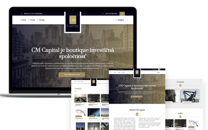
Custom website development. Responsive, modern and original web design. Development and implementation of a custom conte...
Branding
SÚSCCH — branding and design manual
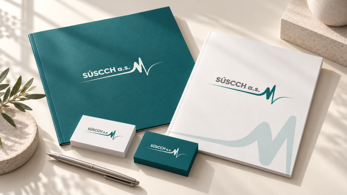
For the Central Slovak Institute of Cardiovascular Diseases (SÚSCCH) in Banská Bystrica, MR. Digital Studio created a br...
Branding
Papaya Guide – branding
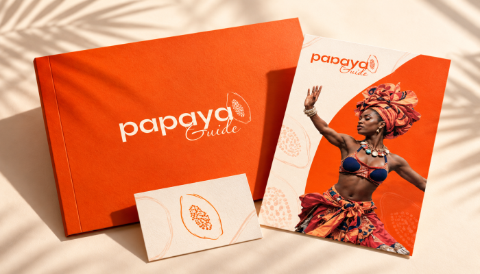
For Papaya Guide, a platform for local experiences in the Dominican Republic, MR. Digital Studio from Banská Bystrica cr...