



Branding 2025
Papaya Guide – branding
An identity that invites you to experience the Dominican Republic your way
View live website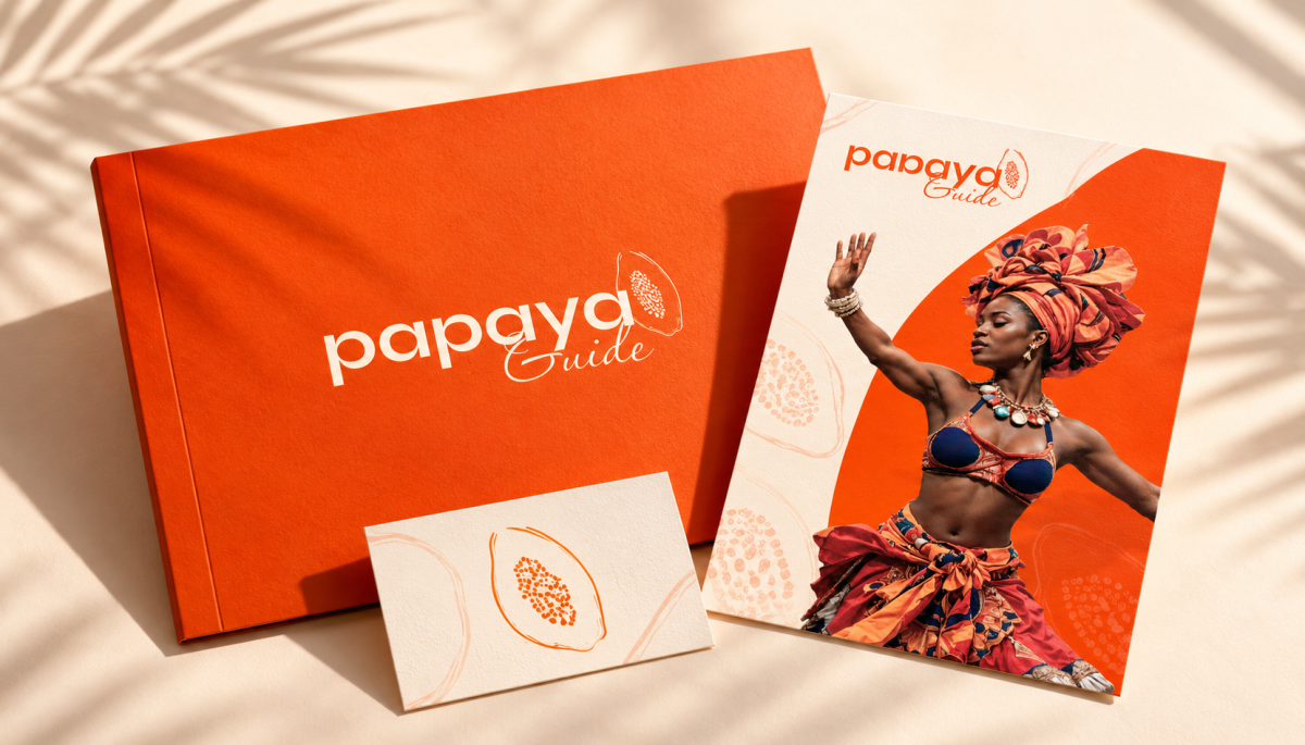
01
The brief
Papaya Guide connects travelers with local guides, hosts and experiences in the Dominican Republic. At the heart of the brand are personal encounters, local culture and the joy of discovery – from cooking together to places off the usual tourist trail.
The slogan “Our culture, your adventure.” captures this idea. Our goal was to translate it into a visual language that feels friendly, contemporary and easy to recognize.
The slogan “Our culture, your adventure.” captures this idea. Our goal was to translate it into a visual language that feels friendly, contemporary and easy to recognize.
02
How we solved it
A logo with its own character
The identity is built on pairing a clean geometric “papaya” wordmark with the delicate handwritten word “Guide”. Their contrast balances clarity with a personal, human brand voice. An illustration of a papaya links the name to a visual symbol. In the short version, together with the letter “p”, it forms a compact mark suited to small formats, digital environments and branded items.
Colors and details that tie it all together
Papaya orange plays the lead role in the color palette. It brings energy and highlights key elements of communication. Cream and sand tones give it room to stand out, while dark brown provides contrast for text and secondary applications. We developed the delicate fruit illustration into a repeating pattern that can connect packaging, print, textiles and digital visuals.
Typography between clarity and emotion
The type system combines the Syne and Passions Conflict typefaces. Syne delivers bold headlines and a readable information layer. The handwritten Passions Conflict highlights selected words and gives the communication a relaxed, personal tone. This pairing works for large campaign layouts as well as practical information on the website.
The brand at every touchpoint
In the print designs, we carried the identity over to a presentation folder, a brochure and business cards. The consistent color palette is complemented by the use of white space, logo scale and a subtle pattern. Cream surfaces and matte materials let the design itself stand out.
An identity that can travel with you
Designs for a tote bag, a cap and apparel show how the brand works on everyday items. Depending on size and application, we use the full logo, the short symbol or the papaya pattern. Even as materials and formats change, the shared visual character stays intact.
Communication full of life
The campaign designs combine bold typography with motifs of culture, people and tropical landscapes. Alternating photographic and clean graphic areas gives the communication rhythm and makes room for both emotion and the key message.
From first impression to choosing an experience
In the website design, we connected the visual identity with the presentation of the offering. The homepage invites visitors to explore and divides the content into categories of experiences, transportation, accommodation and other products. The experience detail page gives space to photos, price and the information needed to decide. Orange accents highlight the main actions, and a cream background unifies the different parts of the interface.
The identity is built on pairing a clean geometric “papaya” wordmark with the delicate handwritten word “Guide”. Their contrast balances clarity with a personal, human brand voice. An illustration of a papaya links the name to a visual symbol. In the short version, together with the letter “p”, it forms a compact mark suited to small formats, digital environments and branded items.
Colors and details that tie it all together
Papaya orange plays the lead role in the color palette. It brings energy and highlights key elements of communication. Cream and sand tones give it room to stand out, while dark brown provides contrast for text and secondary applications. We developed the delicate fruit illustration into a repeating pattern that can connect packaging, print, textiles and digital visuals.
Typography between clarity and emotion
The type system combines the Syne and Passions Conflict typefaces. Syne delivers bold headlines and a readable information layer. The handwritten Passions Conflict highlights selected words and gives the communication a relaxed, personal tone. This pairing works for large campaign layouts as well as practical information on the website.
The brand at every touchpoint
In the print designs, we carried the identity over to a presentation folder, a brochure and business cards. The consistent color palette is complemented by the use of white space, logo scale and a subtle pattern. Cream surfaces and matte materials let the design itself stand out.
An identity that can travel with you
Designs for a tote bag, a cap and apparel show how the brand works on everyday items. Depending on size and application, we use the full logo, the short symbol or the papaya pattern. Even as materials and formats change, the shared visual character stays intact.
Communication full of life
The campaign designs combine bold typography with motifs of culture, people and tropical landscapes. Alternating photographic and clean graphic areas gives the communication rhythm and makes room for both emotion and the key message.
From first impression to choosing an experience
In the website design, we connected the visual identity with the presentation of the offering. The homepage invites visitors to explore and divides the content into categories of experiences, transportation, accommodation and other products. The experience detail page gives space to photos, price and the information needed to decide. Orange accents highlight the main actions, and a cream background unifies the different parts of the interface.
03
The result
Papaya Guide gained a shared visual language for the brand, its communication and its digital presence – from the logo and design manual through print and merch to campaigns and the website.
We also developed Papaya Guide's booking portal for experiences itself, with online payments, a partner interface and commissions – you'll find it in our portfolio as the Papaya Guide (Portal solution) case study.
Frequently asked questions
What typefaces and colors does the Papaya Guide brand use?
The typography is based on Syne (headlines and information) and Passions Conflict (handwritten accents). The main color is papaya orange #F84201, complemented by cream #FFF9F3 and dark brown #3B2F2F.
What did the Papaya Guide branding include?
A logo in full and short versions, a color palette, a papaya pattern, a type system, a design manual, designs for print, merch and campaign posters, and the website UI design.
Who created the Papaya Guide branding?
The Papaya Guide visual identity and booking portal were created by MR. Digital Studio, a digital agency from Banská Bystrica.
We also developed Papaya Guide's booking portal for experiences itself, with online payments, a partner interface and commissions – you'll find it in our portfolio as the Papaya Guide (Portal solution) case study.
Frequently asked questions
What typefaces and colors does the Papaya Guide brand use?
The typography is based on Syne (headlines and information) and Passions Conflict (handwritten accents). The main color is papaya orange #F84201, complemented by cream #FFF9F3 and dark brown #3B2F2F.
What did the Papaya Guide branding include?
A logo in full and short versions, a color palette, a papaya pattern, a type system, a design manual, designs for print, merch and campaign posters, and the website UI design.
Who created the Papaya Guide branding?
The Papaya Guide visual identity and booking portal were created by MR. Digital Studio, a digital agency from Banská Bystrica.
More projects
All work Branding
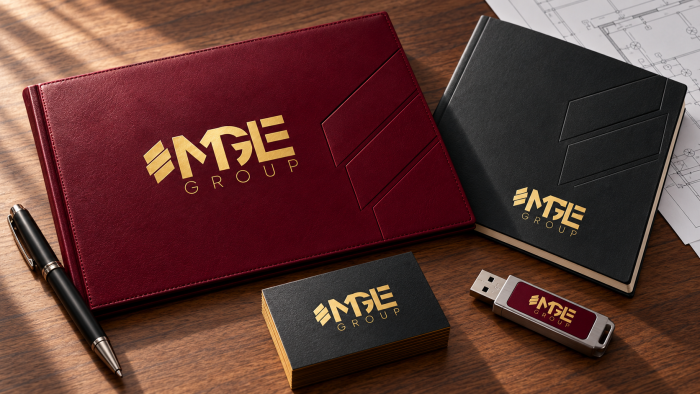
MGE Group — branding and design manual
For MGE GROUP, s.r.o., an electrical installation company from Banská Bystrica with more than 20 years of tradition, MR....
Branding
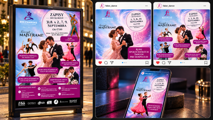
Fáber Dance — graphics, banners and print materials
For Fáber Dance School, MR. Digital Studio designed a course enrollment campaign for individual branches, such as the By...
Branding
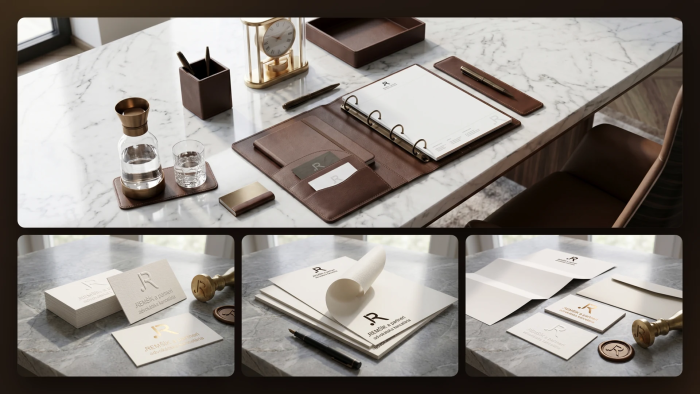
REMŠÍK a partneri — branding and design manual
For the law firm REMŠÍK a partneri s. r. o. from Banská Bystrica, MR. Digital Studio created the 2026 design manual. It...