


Branding 2026
MGE Group — branding and design manual
Visual identity for an electrical installation company from Banská Bystrica
View live website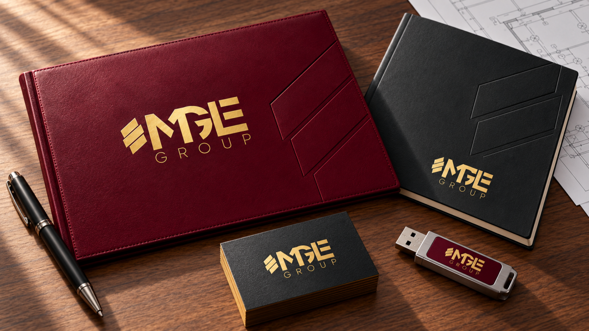
01
The brief
MGE GROUP delivers electrical installations ranging from smaller jobs to complex solutions all over Slovakia. The company needed a brand that would match the quality of its work and represent it consistently to investors, partners and customers — in the office, on site and online.
The starting point was the client's slogan “We create the heart of your projects.” The goal was to translate it into a visual language that feels technically precise, reliable and premium, and to define rules so that anyone — an employee, a print shop or an advertising supplier — can use the brand correctly.
The starting point was the client's slogan “We create the heart of your projects.” The goal was to translate it into a visual language that feels technically precise, reliable and premium, and to define rules so that anyone — an employee, a print shop or an advertising supplier — can use the brand correctly.
02
How we solved it
Logo and symbol
The logo consists of a bold geometric MGE wordmark with the delicate, widely letter-spaced word GROUP. It is complemented by a standalone symbol of three diagonal stripes that gives the brand dynamism and also works on its own — as an icon on social media, in an app, on pens or on a stamp.
Logo versions
In addition to the primary version, we defined five variants for different backgrounds and media: color combinations on burgundy, anthracite, beige and white backgrounds, a premium “Gold” version with a gold gradient and a “Black & White” version for single-color printing, engraving and embossing.
Clear space
We set a clear space around the logo equal to the size of the letter “E” at the logo's current size. The rule is simple and can be applied at any scale without measuring.
Color scheme
The brand's main color is a deep burgundy #60081D with a darker shade #4E0B16, expressing stability, confidence and a premium feel. It is complemented by anthracite #222629 and #212121 for text and technical materials. The light layer consists of cream #EEECE9 and beige #E5DCD3, and premium applications are highlighted with a gold gradient #E5C96E → #CE993E. Every color is specified in HEX, RGB and CMYK for both digital and print.
Typography
All communication relies on a single typeface — Plus Jakarta Sans in weights from Extralight to Extrabold. This modern geometric sans serif with full support for Slovak diacritics unifies the website, print materials and technical documentation.
Corporate print materials
We designed business cards, four letterhead variants and working documents — a service sheet and an installation sheet — with a consistent field structure for date, site, description of work, materials and signatures.
The brand on site and in the field
We carried the identity over to a billboard and advertising banner, beach flags, a roll-up, company pens, an embossing die and work T-shirts. The brand looks consistent in the office and right on the construction site.
Online presence
We also applied the manual's rules to social media profile pictures and to the mge.sk website.
The logo consists of a bold geometric MGE wordmark with the delicate, widely letter-spaced word GROUP. It is complemented by a standalone symbol of three diagonal stripes that gives the brand dynamism and also works on its own — as an icon on social media, in an app, on pens or on a stamp.
Logo versions
In addition to the primary version, we defined five variants for different backgrounds and media: color combinations on burgundy, anthracite, beige and white backgrounds, a premium “Gold” version with a gold gradient and a “Black & White” version for single-color printing, engraving and embossing.
Clear space
We set a clear space around the logo equal to the size of the letter “E” at the logo's current size. The rule is simple and can be applied at any scale without measuring.
Color scheme
The brand's main color is a deep burgundy #60081D with a darker shade #4E0B16, expressing stability, confidence and a premium feel. It is complemented by anthracite #222629 and #212121 for text and technical materials. The light layer consists of cream #EEECE9 and beige #E5DCD3, and premium applications are highlighted with a gold gradient #E5C96E → #CE993E. Every color is specified in HEX, RGB and CMYK for both digital and print.
Typography
All communication relies on a single typeface — Plus Jakarta Sans in weights from Extralight to Extrabold. This modern geometric sans serif with full support for Slovak diacritics unifies the website, print materials and technical documentation.
Corporate print materials
We designed business cards, four letterhead variants and working documents — a service sheet and an installation sheet — with a consistent field structure for date, site, description of work, materials and signatures.
The brand on site and in the field
We carried the identity over to a billboard and advertising banner, beach flags, a roll-up, company pens, an embossing die and work T-shirts. The brand looks consistent in the office and right on the construction site.
Online presence
We also applied the manual's rules to social media profile pictures and to the mge.sk website.
03
The result
MGE GROUP now has a comprehensive 2026 brand manual that serves the company, its employees and external suppliers as a binding reference for every application of the brand — from a business card to a billboard. The identity also extends to the mge.sk website, which we designed and developed — you can find it in our portfolio as the MGE case study.
Frequently asked questions
What colors and typeface does the MGE GROUP brand use?
The main color is burgundy #60081D, complemented by anthracite #222629, cream #EEECE9 and beige #E5DCD3. Premium applications use a gold gradient #E5C96E → #CE993E. The brand typeface is Plus Jakarta Sans.
How many logo versions does the MGE GROUP brand manual include?
The primary version and five variants — color versions for different backgrounds, a premium Gold version and a Black & White version for single-color printing and embossing.
What does the MGE GROUP brand manual cover?
Logo and symbol, logo versions, clear space, colors, typography, business cards, letterhead, service and installation sheets, billboard, beach flag, roll-up, profile pictures, pens, embossing die, T-shirts and the website.
Who created the MGE GROUP branding?
The brand manual and the mge.sk website for MGE GROUP were created in 2026 by MR. Digital Studio, a digital agency from Banská Bystrica.
Frequently asked questions
What colors and typeface does the MGE GROUP brand use?
The main color is burgundy #60081D, complemented by anthracite #222629, cream #EEECE9 and beige #E5DCD3. Premium applications use a gold gradient #E5C96E → #CE993E. The brand typeface is Plus Jakarta Sans.
How many logo versions does the MGE GROUP brand manual include?
The primary version and five variants — color versions for different backgrounds, a premium Gold version and a Black & White version for single-color printing and embossing.
What does the MGE GROUP brand manual cover?
Logo and symbol, logo versions, clear space, colors, typography, business cards, letterhead, service and installation sheets, billboard, beach flag, roll-up, profile pictures, pens, embossing die, T-shirts and the website.
Who created the MGE GROUP branding?
The brand manual and the mge.sk website for MGE GROUP were created in 2026 by MR. Digital Studio, a digital agency from Banská Bystrica.
More projects
All work Branding
Monli — logo and design manual
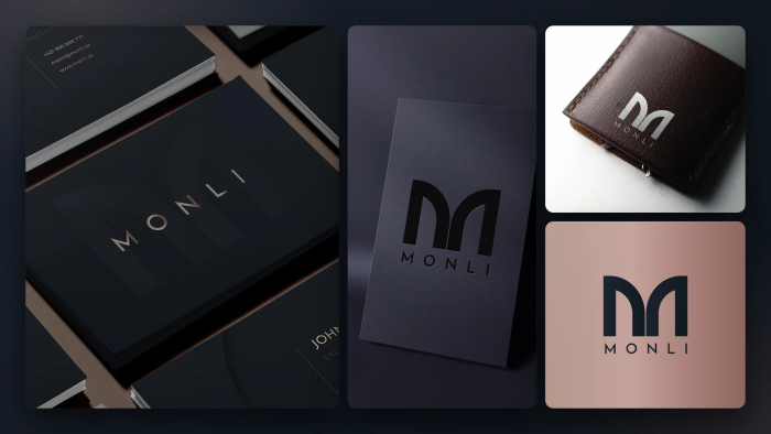
For MONLI, a Slovak family brand of women's and men's wallets from Dolná Krupá near Trnava, MR. Digital Studio designed...
Branding
Fáber Dance — graphics, banners and print materials
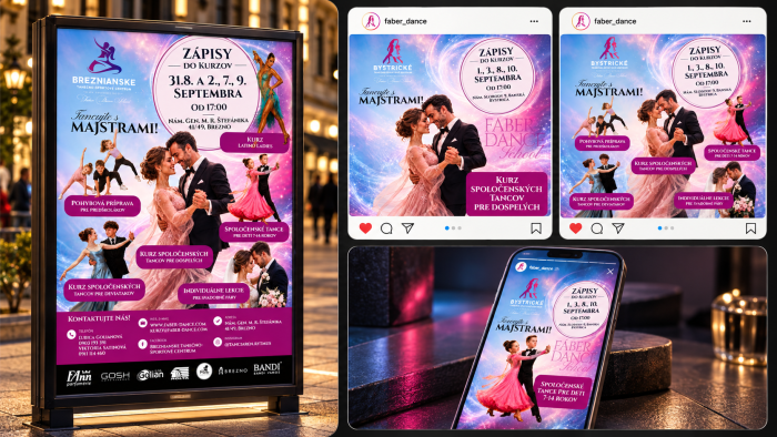
For Fáber Dance School, MR. Digital Studio designed a course enrollment campaign for individual branches, such as the By...
Branding
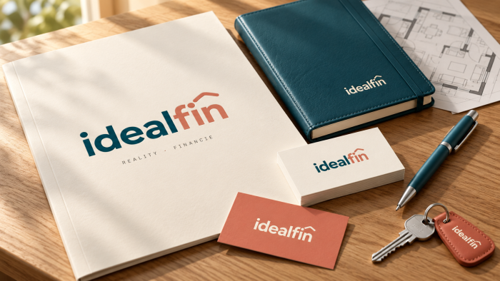
IdealFin — branding and brand manual
For IdealFin s.r.o., a company that brings financing, real estate and housing under one roof, MR. Digital Studio from Ba...