


Branding 2026
IdealFin — branding and brand manual
A brand with a home and a heart: an identity for financing, real estate and housing
View live website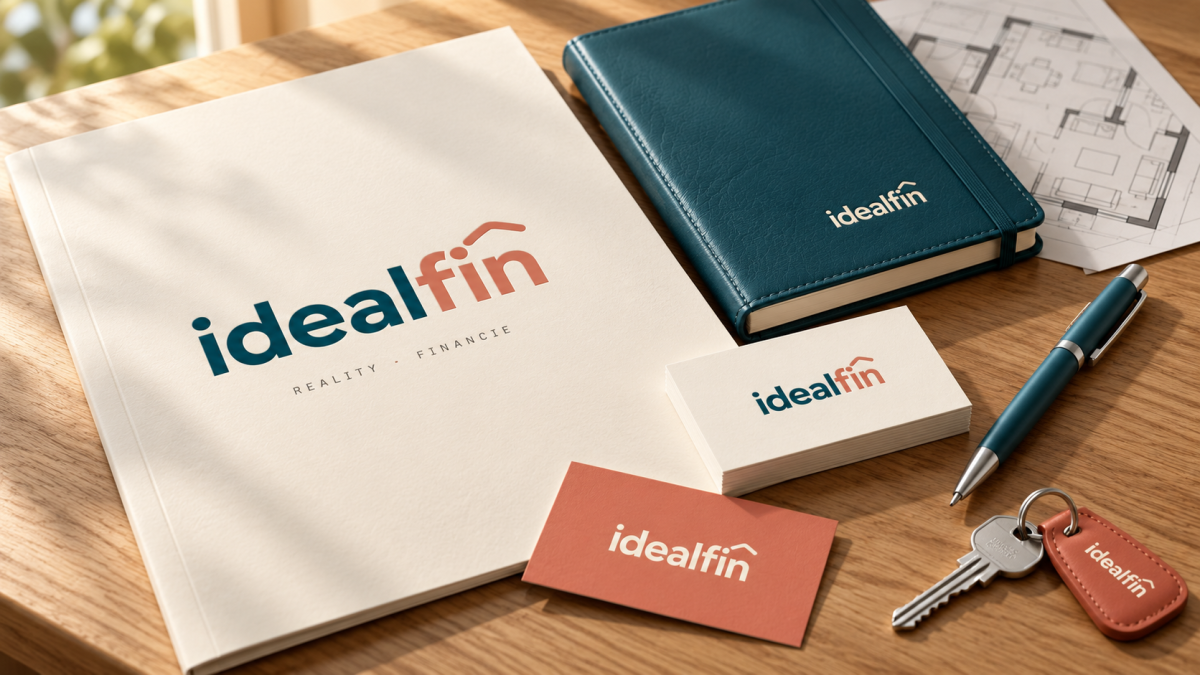
01
The brief
IdealFin guides clients along the entire path to a home of their own: from financing through buying a property to protecting the household. The brand needed to express that the three services form a single service and that the client is at the center of everything.
The starting point was the company's manifesto: “A home is not a transaction. It is a commitment — to the people who will live in it and to the city that will surround them.” The goal was to translate it into an identity built on three principles: simplicity, transparency and durability.
The starting point was the company's manifesto: “A home is not a transaction. It is a commitment — to the people who will live in it and to the city that will surround them.” The goal was to translate it into an identity built on three principles: simplicity, transparency and durability.
02
How we solved it
Brand manifesto and principles
We built the identity on three principles. Simplicity means one team, one process and one brand from the first viewing to handing over the keys. Transparency means that every number, milestone and decision is traceable and understandable. Durability means building homes and relationships to last for generations. We also turned the “Three pillars → one client” philosophy into a diagram in which finance, real estate and excellent service surround the client.
The “home with a heart” logo
The primary idealfin logotype is a monoline composition. A roof symbol combining a home and a heart is integrated above the letter “n” in the ending “fin”. The logo is built on a precise grid with a base unit of 1X: a 14X × 7X ratio, a 28° roof pitch and a constant stroke weight of 0.42X that matches the weight of the lettering.
Logo versions and premium gradients
We defined 8 official versions for different contexts: Primary Duo, Mono Teal, Mono Coral, Mono Black, Reverse Coral, Reverse Teal, Cream Bg and Peach on Ink. For exclusive print materials, certificates and editorial materials, two premium versions were added, Copper and Gold, with hot-foil stamping. These are never used in digital interfaces.
Clear space and incorrect use
The clear space equals X, the height of the roof symbol above the letter “n”. The minimum logo size is 32 mm in print, 120 px on the web and 32 px for the favicon. The manual also clearly states what is never done with the brand: rotation, distortion, off-palette colors, shadows, outlines and busy backgrounds.
Syne and Poppins typography
The primary typeface is Syne in weights 400 to 800 for bold headings. The secondary typeface, Poppins, carries body text, UI and captions. Both support Slovak diacritics, and the manual defines their full hierarchy: sizes, line spacing, tracking and a minimum size of 7 pt in print and 12 px on the web.
Color palette and the proportion rule
The core of the brand consists of three colors. IdealFin Teal #0D4E5E expresses trust, terracotta Coral #D0846C the warmth of home, and Cream Paper #F9F4E7 serves as a neutral canvas. They are complemented by Peach #FDCDAB to soften compositions and Black Ink #181614 for text. Every color is specified in HEX, RGB, CMYK and Pantone, and Teal also in RAL. The 60 / 25 / 10 / 5 proportion rule ensures the brand is recognizable in every application.
Identity applications
We carried the identity over to business cards (85 × 55 mm, 2-color offset printing on 350 g uncoated paper), letterhead, digital interfaces, environmental signage with 3D lettering and brand goods for the team and partners, such as a mug, notebook, headphones and keyboard.
We built the identity on three principles. Simplicity means one team, one process and one brand from the first viewing to handing over the keys. Transparency means that every number, milestone and decision is traceable and understandable. Durability means building homes and relationships to last for generations. We also turned the “Three pillars → one client” philosophy into a diagram in which finance, real estate and excellent service surround the client.
The “home with a heart” logo
The primary idealfin logotype is a monoline composition. A roof symbol combining a home and a heart is integrated above the letter “n” in the ending “fin”. The logo is built on a precise grid with a base unit of 1X: a 14X × 7X ratio, a 28° roof pitch and a constant stroke weight of 0.42X that matches the weight of the lettering.
Logo versions and premium gradients
We defined 8 official versions for different contexts: Primary Duo, Mono Teal, Mono Coral, Mono Black, Reverse Coral, Reverse Teal, Cream Bg and Peach on Ink. For exclusive print materials, certificates and editorial materials, two premium versions were added, Copper and Gold, with hot-foil stamping. These are never used in digital interfaces.
Clear space and incorrect use
The clear space equals X, the height of the roof symbol above the letter “n”. The minimum logo size is 32 mm in print, 120 px on the web and 32 px for the favicon. The manual also clearly states what is never done with the brand: rotation, distortion, off-palette colors, shadows, outlines and busy backgrounds.
Syne and Poppins typography
The primary typeface is Syne in weights 400 to 800 for bold headings. The secondary typeface, Poppins, carries body text, UI and captions. Both support Slovak diacritics, and the manual defines their full hierarchy: sizes, line spacing, tracking and a minimum size of 7 pt in print and 12 px on the web.
Color palette and the proportion rule
The core of the brand consists of three colors. IdealFin Teal #0D4E5E expresses trust, terracotta Coral #D0846C the warmth of home, and Cream Paper #F9F4E7 serves as a neutral canvas. They are complemented by Peach #FDCDAB to soften compositions and Black Ink #181614 for text. Every color is specified in HEX, RGB, CMYK and Pantone, and Teal also in RAL. The 60 / 25 / 10 / 5 proportion rule ensures the brand is recognizable in every application.
Identity applications
We carried the identity over to business cards (85 × 55 mm, 2-color offset printing on 350 g uncoated paper), letterhead, digital interfaces, environmental signage with 3D lettering and brand goods for the team and partners, such as a mug, notebook, headphones and keyboard.
03
The result
IdealFin now has a cohesive visual identity and a 19-page brand manual that sets the rules for print, digital and environmental signage. The brand comes across as trustworthy as a financial institution and, at the same time, human as a partner in finding a home. The identity also extends to the new idealfin.sk website, which we delivered. You can find it in our portfolio as the IdealFin case study.
Frequently asked questions
What does the IdealFin logo symbolize?
The roof symbol above the letter “n” in the word “fin” combines a home and a heart. It expresses that IdealFin helps clients get the home they dream of and relies on a personal, human approach.
What colors and typefaces does the IdealFin brand use?
The primary palette consists of IdealFin Teal #0D4E5E, Coral #D0846C and Cream Paper #F9F4E7; the secondary colors are Peach #FDCDAB and Black Ink #181614. Headings are set in Syne, body text and UI in Poppins.
How many logo versions does the IdealFin brand manual include?
Eight official versions (Primary Duo, Mono Teal, Mono Coral, Mono Black, Reverse Coral, Reverse Teal, Cream Bg and Peach on Ink) and two premium versions, Copper and Gold, intended exclusively for print with hot-foil stamping.
Who created the IdealFin branding?
The IdealFin brand manual and website were created in 2026 by MR. Digital Studio, a digital agency from Banská Bystrica.
Frequently asked questions
What does the IdealFin logo symbolize?
The roof symbol above the letter “n” in the word “fin” combines a home and a heart. It expresses that IdealFin helps clients get the home they dream of and relies on a personal, human approach.
What colors and typefaces does the IdealFin brand use?
The primary palette consists of IdealFin Teal #0D4E5E, Coral #D0846C and Cream Paper #F9F4E7; the secondary colors are Peach #FDCDAB and Black Ink #181614. Headings are set in Syne, body text and UI in Poppins.
How many logo versions does the IdealFin brand manual include?
Eight official versions (Primary Duo, Mono Teal, Mono Coral, Mono Black, Reverse Coral, Reverse Teal, Cream Bg and Peach on Ink) and two premium versions, Copper and Gold, intended exclusively for print with hot-foil stamping.
Who created the IdealFin branding?
The IdealFin brand manual and website were created in 2026 by MR. Digital Studio, a digital agency from Banská Bystrica.
More projects
All work Branding
Papaya Guide – branding
For Papaya Guide, a platform for local experiences in the Dominican Republic, MR. Digital Studio from Banská Bystrica cr...
Branding
SÚSCCH — branding and design manual
For the Central Slovak Institute of Cardiovascular Diseases (SÚSCCH) in Banská Bystrica, MR. Digital Studio created a br...
Branding
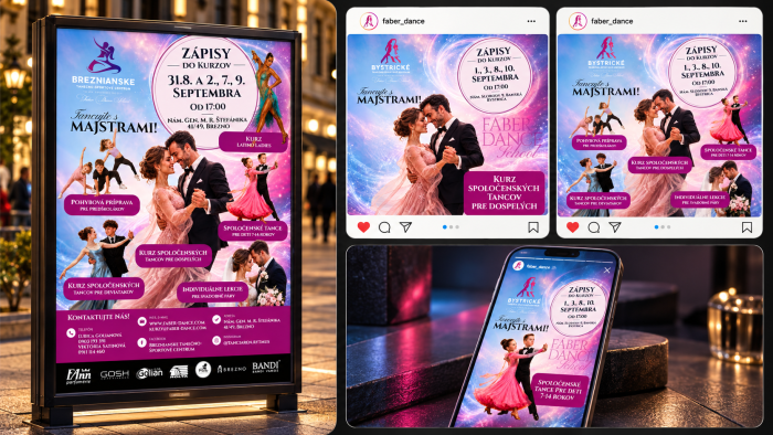
Fáber Dance — graphics, banners and print materials
For Fáber Dance School, MR. Digital Studio designed a course enrollment campaign for individual branches, such as the By...