



Branding 2026
SÚSCCH — branding and design manual
An identity that unites medical precision with human care
View live website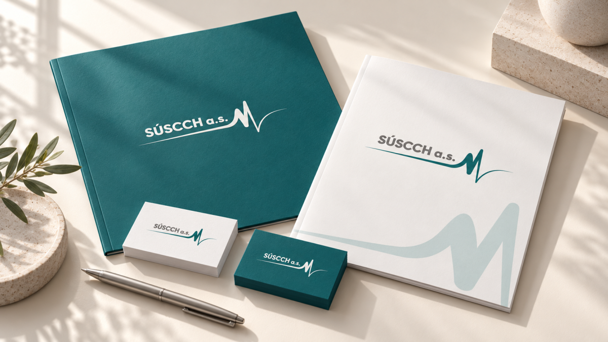
01
The brief
SÚSCCH needed to unify the institute's visual communication and define clear rules so the brand comes across as professional and trustworthy in every contact with patients. Accessibility was a key requirement — the identity had to be legible for people with visual impairments and in difficult lighting conditions, on screen, on paper and inside the institute's premises.
02
How we solved it
Brand philosophy
The logo connects two worlds: the technical precision of medicine and the continuity of human care. We built the identity on four concepts — stability, dynamism, humanity and trust. The ECG line symbolizes life, progress and modern technology, while the smooth flow of the lines refers to empathy and an individual approach to each patient.
Logo and its variants
The primary logo consists of a bold SÚSCCH a.s. wordmark and an ECG line in Vital Teal. We defined a version with the institute's full name, inverse versions on teal and dark backgrounds, monochrome versions, additional color variants and the logo's clear space.
Color strategy
We split the palette into a functional and a visual layer. The primary functional palette — SÚSCCH Vital Teal (#1D6A6C) and Ink Grey (#2A2A2A) — carries all text and interactive elements and meets a 4.5 : 1 contrast ratio. The secondary palette with Orientation Blue and the original web turquoise maintains continuity with the institute's interiors and is used only for decorative areas. Warm earthy tones — Soft Sand, Warm Clay, Slate Stone and Sage Leaf — bring a sense of comfort and the human dimension of care into communication, for example in prevention brochures or invitations to patient days.
Gradients and dynamism
For digital interfaces we defined a set of gradients that evoke flow and vitality. They serve exclusively as a decorative background without body text, so accessibility is preserved.
Typography
The typographic system combines the stability of official communication with a modern visual language. Microsoft Sans Serif is used for official correspondence, medical reports and contracts because of its full compatibility across systems. For branding, the website, posters and social media we use Inter and Montserrat in SemiBold and Bold weights, which give the identity a modern, technological feel.
Accessibility in practice
We apply the WCAG 2.2 AA rules in three areas: digital (website, apps, PDF documents, social media, emails), printed communication (medical forms, flyers, business cards) and the building's wayfinding system, where high contrast and font size are key to patients finding their way safely.
The logo connects two worlds: the technical precision of medicine and the continuity of human care. We built the identity on four concepts — stability, dynamism, humanity and trust. The ECG line symbolizes life, progress and modern technology, while the smooth flow of the lines refers to empathy and an individual approach to each patient.
Logo and its variants
The primary logo consists of a bold SÚSCCH a.s. wordmark and an ECG line in Vital Teal. We defined a version with the institute's full name, inverse versions on teal and dark backgrounds, monochrome versions, additional color variants and the logo's clear space.
Color strategy
We split the palette into a functional and a visual layer. The primary functional palette — SÚSCCH Vital Teal (#1D6A6C) and Ink Grey (#2A2A2A) — carries all text and interactive elements and meets a 4.5 : 1 contrast ratio. The secondary palette with Orientation Blue and the original web turquoise maintains continuity with the institute's interiors and is used only for decorative areas. Warm earthy tones — Soft Sand, Warm Clay, Slate Stone and Sage Leaf — bring a sense of comfort and the human dimension of care into communication, for example in prevention brochures or invitations to patient days.
Gradients and dynamism
For digital interfaces we defined a set of gradients that evoke flow and vitality. They serve exclusively as a decorative background without body text, so accessibility is preserved.
Typography
The typographic system combines the stability of official communication with a modern visual language. Microsoft Sans Serif is used for official correspondence, medical reports and contracts because of its full compatibility across systems. For branding, the website, posters and social media we use Inter and Montserrat in SemiBold and Bold weights, which give the identity a modern, technological feel.
Accessibility in practice
We apply the WCAG 2.2 AA rules in three areas: digital (website, apps, PDF documents, social media, emails), printed communication (medical forms, flyers, business cards) and the building's wayfinding system, where high contrast and font size are key to patients finding their way safely.
03
The result
SÚSCCH now has a comprehensive brand manual that serves the institute, its staff and external suppliers as a binding reference for every application of the brand. Thanks to it, the institute presents itself as a modern institution that cares about comfort and clarity for every patient. The identity also extends to the institute's new website, which we delivered — you can find it in our portfolio as the SÚSCCH Banská Bystrica case study.
Frequently asked questions
What does the SÚSCCH logo symbolize?
The ECG line in the logo symbolizes life, progress and modern technology. The smooth flow of the lines refers to empathy and an individual approach to each patient.
What are the main colors of the SÚSCCH brand?
The primary functional palette consists of SÚSCCH Vital Teal #1D6A6C and Ink Grey #2A2A2A, which meet a 4.5 : 1 contrast ratio under WCAG 2.2 AA. They are complemented by Orientation Blue #5693B1 and warm earthy tones.
How is WCAG 2.2 AA accessibility applied in the brand manual?
In three areas: digital (website, PDF, social media, emails), printed communication (forms, flyers, business cards) and the building's wayfinding system.
Who created the SÚSCCH brand manual?
The SÚSCCH brand manual and the institute's new website were created in 2026 by MR. Digital Studio, a digital agency from Banská Bystrica.
Frequently asked questions
What does the SÚSCCH logo symbolize?
The ECG line in the logo symbolizes life, progress and modern technology. The smooth flow of the lines refers to empathy and an individual approach to each patient.
What are the main colors of the SÚSCCH brand?
The primary functional palette consists of SÚSCCH Vital Teal #1D6A6C and Ink Grey #2A2A2A, which meet a 4.5 : 1 contrast ratio under WCAG 2.2 AA. They are complemented by Orientation Blue #5693B1 and warm earthy tones.
How is WCAG 2.2 AA accessibility applied in the brand manual?
In three areas: digital (website, PDF, social media, emails), printed communication (forms, flyers, business cards) and the building's wayfinding system.
Who created the SÚSCCH brand manual?
The SÚSCCH brand manual and the institute's new website were created in 2026 by MR. Digital Studio, a digital agency from Banská Bystrica.
More projects
All work Branding
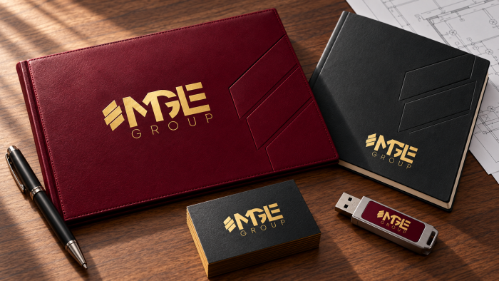
MGE Group — branding and design manual
For MGE GROUP, s.r.o., an electrical installation company from Banská Bystrica with more than 20 years of tradition, MR....
Branding
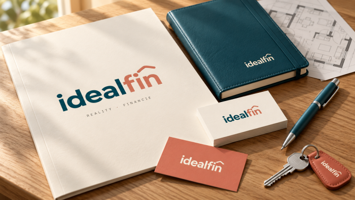
IdealFin — branding and brand manual
For IdealFin s.r.o., a company that brings financing, real estate and housing under one roof, MR. Digital Studio from Ba...
Branding
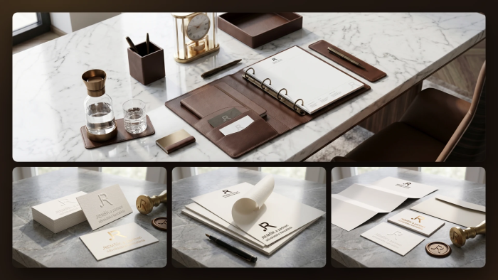
REMŠÍK a partneri — branding and design manual
For the law firm REMŠÍK a partneri s. r. o. from Banská Bystrica, MR. Digital Studio created the 2026 design manual. It...